
NCS5500 Data Plane Monitoring
Hopefully, by today you feel pretty confident with IOS XR Telemetry basics, you know how Pipeline works and even started exploring IOS XR MDT with the collection stack. Most probably you have one question. Is there anything beyond “Interfaces, Memory, and CPU” to monitor fast and efficiently with telemetry? In this post, we will go through a new group of dashboards for the Collector Stack to monitor different NPU tables in NCS5500.
A Very Short RIB/FIB Overview
The decision to start showing “advanced” use cases with routing/forwarding was easy to take. This is something that your routers should do at any moment, and you’re probably really interested in being sure that yes, my network is forwarding traffic as expected.
The routing/forwarding in a router is not a single or two-step process. It involves many different components and protocols, interacting with each other.
At a very high level, one may divide the process into two big planes: control plane protocols and the data plane. The role of the control plane protocols is to “talk” to each other to share some information they have. The goal of the data plane is to “use” information from a group of control protocols to build the forwarding plane and properly move packets from ingress to egress ports.
Here is a “bird’s eye” view of components involved in routing/forwarding:

The process usually starts with routing or label distribution protocols. They “put” their information either in RIB (Routing Information Base) or LSD (Label Switching Database). (A keen observer would also remember that protocols like BGP or OSPF also have their own routing databases before RIB, but, again, this is a high-level picture).
After information is collected into RIB/LSD, it will be delivered to FIB (or CEF) using some internal transport protocol (reliable and very efficient!). Adjacency information is also added to FIB, to make forwarding fast and efficient. This is done through ARP and AIB (Adjacency Information Base).
When it comes to big and powerful routers, you might want to protect yourself and the investments by creating different layers of abstractions. It is also applicable to FIB. The main task of FIB is to provide forwarding. As you know, forwarding is (roughly) based on IP addresses (either IPv4 or IPv6) or, it can be MPLS switching. There are many IPv4 and IPv6 addresses in the global routing table today. Different platforms use different NPUs and different ways to store those IP address in tables. That’s why FIB also has abstractions and represented in two layers, PI (Product Independent layer) and PD (Product Dependent layer). FIB PI represents a generic view of forwarding on any platform. FIB PD is different per platform family (or, to be more exact, per NPU family). One can also call it DPA (Data Plane Abstraction layer). The goal of FIB PD is to update hardware tables on the NPU using some specific API. You can also check this excellent video to see the flow of routes from BGP down to NPU.
Initially, the idea was to start showing use cases in the top->down direction. But my co-worker Nicolas Fevrier wrote great articles about NPU tables on NCS5500, and we got many questions about NPU monitoring, so, the priority was swapped to the down->top approach. If you haven’t yet read NCS5500 posts, go here: https://xrdocs.io/cloud-scale-networking/tutorials/. It is highly recommended for you to know the basics about those NPU tables to move on with this document.
Use Case Details and Topology Used
Here is the summary of dashboards that will be explained in this document:
- LEM/LPM/FEC/ECMP-FEC/ENCAP/eTCAM tables instant view (network)
- LEM/LPM/FEC/ECMP-FEC/ENCAP/eTCAM tables and IPv4/IPv6/MPLS/etc allocation historical overview (network)
- LEM/LPM/FEC/ECMP-FEC/ENCAP/eTCAM tables and IPv4/IPv6/MPLS/etc allocation per node (node)
- An instant snapshot of a big set of different NPU internal counters (node)
All dashboards created for this use cases are split into two big categories, network-wide view and node view. The purpose of the network view is to give you an overview in general, how NPU tables are used across all your devices. The device view can give you more information about some node, that you want to troubleshoot.
To ease your understanding of how to use dashboards, snapshots, and videos from the real topology will be used. The topology is based on six IOS XR routers (five NCS55xx and one ASR9k). Here is how they are interconnected:
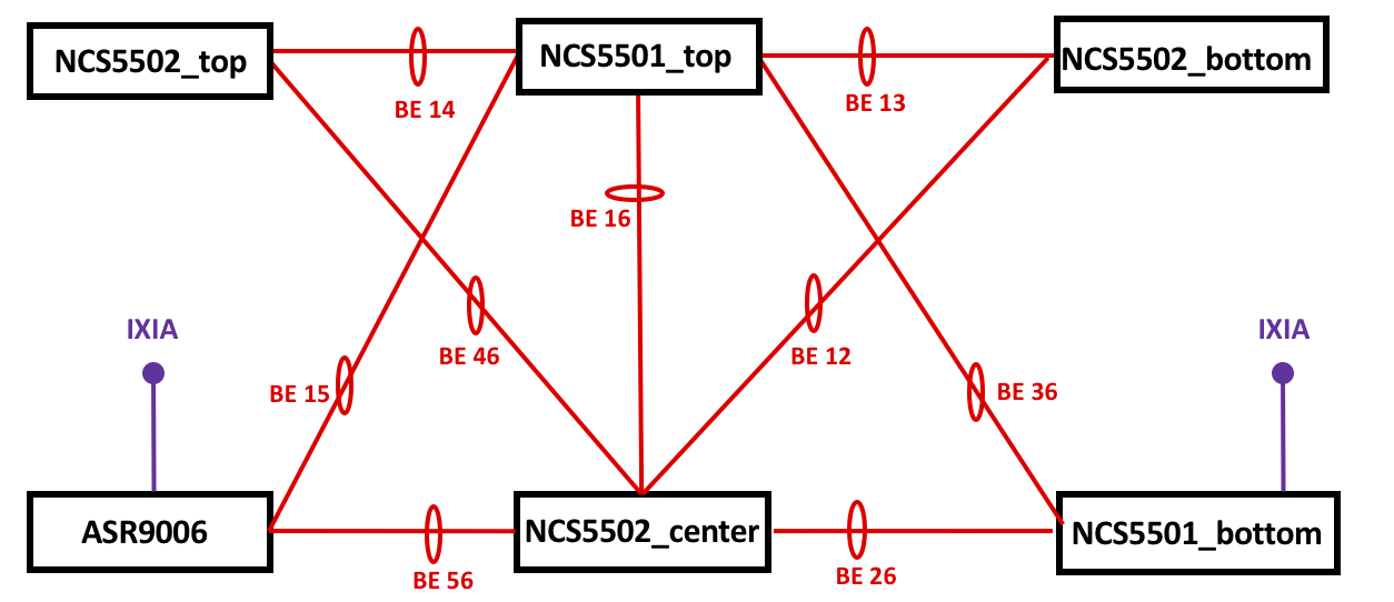
All the devices are interconnected by Ethernet bundle links. ASR9006 and NCS5501_bottom have IXIA ports connected for traffic generation.
IOS XR 6.3.3 is used across every platform (it should work with other releases as well, but this demo is on 6.3.3).
You will need to have these sensor paths configured on your routers:
telemetry model-driven
 sensor-group NCS55xx_NPU
  sensor-path Cisco-IOS-XR-fretta-bcm-dpa-hw-resources-oper:dpa/stats/nodes/node/hw-resources-datas/hw-resources-data
  sensor-path Cisco-IOS-XR-fretta-bcm-dpa-hw-resources-oper:dpa/stats/nodes/node/asic-statistics/asic-statistics-for-npu-ids/asic-statistics-for-npu-id
  !
Also, please consider the dashboards as something that you can start with. There was no intention to make them as FINAL versions of graphs. The goal is to show you HOW you can use and build graphs that will fit your network, your tasks. Examples here should (hopefully!) inspire you to move forward!
NPU Tables: Network View
All panels for the network view are located within the “NCS55xx Global View” dashboard. The panels there can be split into two main categories:
- Instant view
- Historical view
Network Instant View
The “instant view” panels will provide you with information about the state of all tables “right now”. Here is an example of such a table to explain how it works (all the panels from “instant view” are based on this “template”):

On the left side, you will see an instant view of the amount of the LEM entries within every NCS55xx in the topology (from the lab). On the right side, you can see immediate changes of the LEM entries on each router. Both sides represent the topology used in tests. This topology doesn’t have all the links but shows necessary interconnections (you can draw all the connections if you want!).
To draw a topology, you need to use a specific plugin, diagram. You don’t need to install it right away, as it was included in the Telemetry Stack from the very beginning!
In my example, I’m monitoring every table for the highest possible value (across all line cards and NPUs). I see this as a convenient way to quickly see if something is wrong on a node in your network. You can specify exact linecard and exact NPU if you want, of course. Also, please remember, that for LEM/LPM/FEC/ECMP-FEC you should have the same values across every NPU in your chassis (unless you’re using “Selective Route Download”). The only table that you might want to track separately is ENCAP. ENCAP will contain unique adjacency information per every NPU.
There is nothing exceptional with the left topology (we’re just showing the current state). For the right topology, the panel will show you the difference between the two following values. So, if you have LEM entries added, it will be seen as “+N”. If you have entries deleted, it will show “-M”.
For both sides colored background is used. For the left side, topology colors follow general OOR recommendations with 80% for the “yellow” state and 95% for “red” state. For the topology on the right, you will see the white background for a stable state. The green background is used when entries are added, and red is the color for removal.
Here is a short video showing you how it looks like in real life:
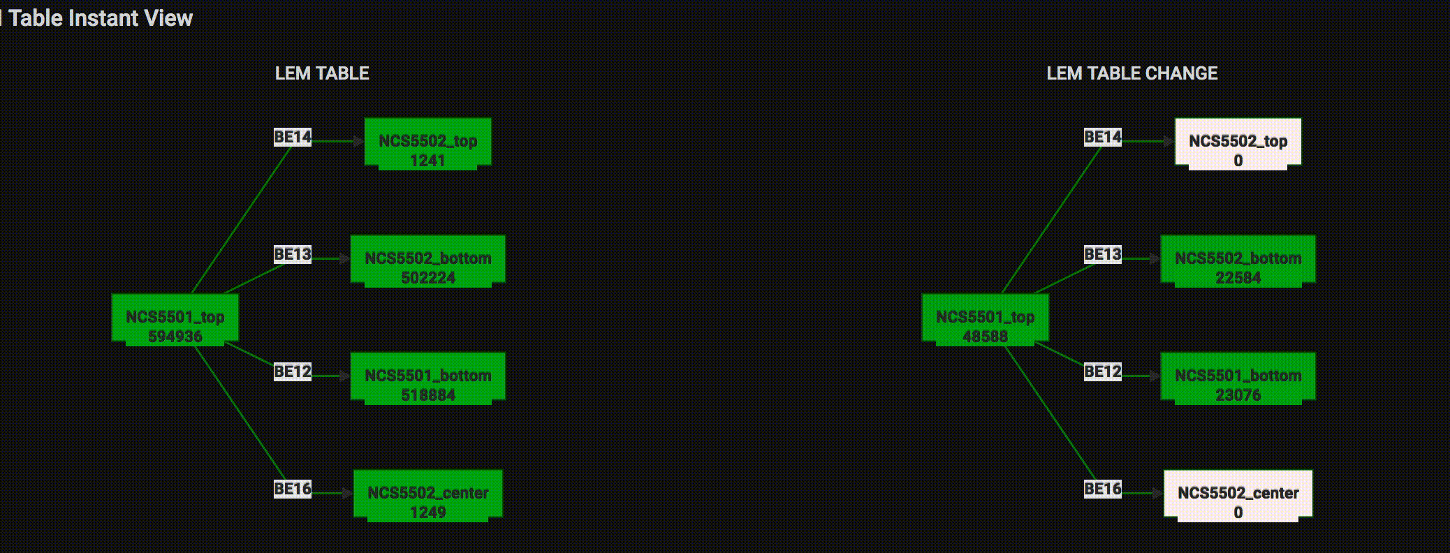
All other panels have the same look. Hence, skipping the description here.
Network Historical View
As you can guess from the name, historical view gives you the information about what happened to a table over some period of time.
For example, here is a historical overview of the LEM table during the change of the routes (for the video above):

Not bad, right?
In historical overview panels you can also find more granular information about each database:
- LEM: IPv4 entries, IPv6 entries, MPLS entries
- LPM: IPv6 entries, IPv4 multicast entries, IPv6 multicast entries
- FEC: IPv4 nexthop group, IPv6 nexthop group
- ECMP-FEC: IPv4 nexthop group, IPv6 nexthop group
- EEDB (Encap): IPv4 nexthop, IPv6 nexthop
- eTCAM: IPv4 entries
Here is an example of FEC IPv4 nexthop group change (FEC corresponds to SHLDI or R-SHLDI in FIB PI and new entries were created/deleted when ExaBGP routers were activated/disabled for the video above):

Those panels give more detailed info, as they include all entries per each NPU on every line card installed. Again, this is just to show you HOW to use the data. Feel free to use that as your start and add other panels that you need!
NPU Tables: Node View
This is the second (and last!) dashboard for our NPU counters telemetry use case.
On the very top of the dashboard you can see a control line:

There you can select your Router, and within that router you can choose the line card (e.g., 0/0/CPU0), and within the card select the exact NPU number. Those values will be auto-discovered for you, no need to manually insert anything.
Those variables are built hierarchically. It means that every following selection is based on a previous one (e.g., you can select a node only for the selected router).
For that dashboard, the pie chart plugin is used. As before, feel free to use any other panel you like. The pie chart is also part of the Collector Stack (as the diagram plugin) for your convenience.
The very top panel shows you a combined view for all tables for the router/card/NPU you selected:

Next, you can see the allocation of IPv4 routes (among LEM, LPM or eTCAM), IPv6 routes (LPM or LEM) and so on.
Here is an example from NCS5502_center showing that most of its IPv4 routes are in eTCAM:

NPU Internal Counters
IOS XR Model Driven Telemetry also allows you to push a significant number of different internal counters from an NPU.
We can’t share details behind those counters or meaning of them because of NDA, but it still might be helpful in two situations:
- You know what they mean, and they will make sense for you
- You don’t know about every counter but can guess what “discard” or “deleted” could mean and use that for faster troubleshooting (or showing them to a Cisco TAC engineer).
Here is an example snapshot how it looks for the same NCS5502_center:

This is just a small subset of 61 counters available in the dashboard.
A Quick Reaction Example
A nice way to finish this post is to show a simple use case with the NPU counters discussed. The simplest way to get benefits from streamed NPU counters is to send notifications about OOR situations with the routers in your network. After getting such a notification (it can be done with Grafana itself or Kapacitor from InfluxData) a member of your NOC team can do something (like, drain that router).
But let’s make one more step and try to do a straightforward reaction to move the router under stress away from traffic flow (just as an example of remediation that many web guys do in their networks)
Have a look at the topology shown at the beginning of this post. In a stable network, traffic between IXIA’s ports (between ASR9006 and NCS5501_bottom) has this path:
IXIA port 1 <--> ASR9006 <-- (BE15) --> NCS5501_top <-- (BE36) --> NCS5501_bottom <--> IXIA port 2
There are several ExaBGP routers connected to NCS5501_top (eBGP). Routers will announce many routes to create an oversubscription situation. NCS5501_top (device under stress, or DUS) will have its LEM (IPv4) table almost full. The goal will be to protect traffic and drain DUS out.
When oversubscription happens, the following actions are done:
- Kapacitor (continually monitors the tables) will send an alert right after crossing a threshold;
- The running Python script will get this alert, parse the name of the device under stress, connect to the Influxdb database to get information about DUS LLDP neighbors.
- After collecting the IDs of the neighbors, the script will connect to every found neighbor and increase the ISIS metric for all interfaces leading to DUS. The connection is done using Netmiko. You can also use Ansible if you want.
- After updating the ISIS metric, a notification will be pushed to a Slack channel.
- Traffic will stop flowing through DUS and start using another path, through NCS5502_center.
The scripts mentioned here are just examples to demonstrate what you can do with the data. They are highly simplified to quickly show a reaction. In no way they can be considered as prod level code, and many steps are just missing for the sake of demo (e.g., different checks and confirmations, optimizations to make it faster, etc.).
Here is how it looks like:

As you can see, the traffic was switched almost instantly after the router met OOR situation with zero involvement from a human!
After you managed the situation and the amount of LEM entries is below the threshold, you will get another notification that the router is okay now:

This is how you can use IOS XR telemetry and programmability to have a basic remediation done for your network.
To have this up and running you will need to have the “metrics.json” file for Pipeline and dashboards for Grafana. They are prepared for you and available on Github
Conclusion
This post covered different NCS55xx NPU counters that can be pushed with IOS XR Model Driven Telemetry. With that information, you can monitor the load of forwarding tables almost in real time and act appropriately if needed. Everything is prepared for you. Download it and try in your lab. Hope, you enjoy it. Keep your eyes opened, there are awesome things coming for NCS55xx pretty soon!
Leave a Comment